13 Nov Responsive Web Design
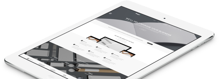
It’s the way of making a single website that works effectively on both desktop browsers and on mobile devices. Responsive architecture gives the best quality browsing experience – whether on a mobile phone, tablet, and regardless of the operating system.
People who browse while on-the-go have very different needs than those sitting at a desk. Responsive web sites re-organize themselves automatically according to the device viewing them, so that the same website provides a great experience everywhere. Desktops get a full-blown interface with videos, large images and animations. Smartphones get a simplified website that runs fast without the bells and whistles. Tablets get something in between.
Delivering an App-Like Experience.
Mobile environments require simpler navigation, focused content and fast page loads. If a website has a responsive design, the user does not have to manipulate the site using “pinch and zoom,” and the flow of content is more appropriate for a smaller screen. The site may reduce the amount of content presented to the mobile visitor, so it has less clutter and is easier to use.
Get your free assessment to see if Responsive Website is right for you
Error: Contact form not found.